Cross-team Collaboration - Placester CRM
Real Estate Agents measure their success by the number of properties they sell and they measure the ROI of the products they invest in by the number of leads acquired through them. This is a story of evolution -- of how a cross functional, cross-team collaboration evolved a product from a desktop only view to mobile and back again.
Leads List
This project, unfortunately, did not begin as a case of mobile-first, but it became one. The leads index was first designed for desktop only with a single high-level objective and a couple of tactical goals.
Objective: An agent does not spend a lot of time at their desk, so they need to be able to view and make edits to a lead's details very quickly.
Goal: Make a summary of a lead's details accessible within the confines of the existing grid
Goal: Allow the agent to edit and manipulate the content of that lead from this single screen.
The design for desktop worked fine, users could scan summary information about a lead, edit these basic details inline, and get to a detail page . However the design was complicated and with the hard-coded content area width, we were stuck with a horizontal scroll (fairly acceptable at the time of design in other applications like Salesforce or Follow up Boss, but not desirable).
Mobile
When it came time to design the leads list for mobile, it was an entirely new team working on the design. The technical and style limitations of the existing web app did not exist, so that team, with my overall guidance, decided to make this the next generation of how we would approach a list of leads. choosing more of a card view rather than a traditional table. This proved easier to scan and more efficient to search. Taking into account the user's change in physical environment when using their mobile device and the inherent variations in behaviors interacting with varying form factors, the design on mobile highlights the lead details critical for mobile communication. The evolution of the leads table for the desktop web app was considered and discussed throughout the mobile design process, with representatives from all 3 team's UX designers present in critiques and reviews.
The New Leads List
The Leads list evolved based on user research done by the Mobile and CRM teams, to make the experience more consistent with the mobile version, simplifying the reporting that was originally displayed. You can certainly more easily picture the cards at the top responding to various browser widths and evolving to mobile web in a view that is more in-line with what is currently in native mobile, creating a more cohesive experience with our products.
Team Collaboration
There were different UX designers responsible for each of the parts of these projects. At the time of each rework of the feature for different form factors product was not defining a vision for the overall feature or product and how they relate. The UX team, which I led, advocated for the collaboration of teams and the evolution of the features on multiple form factors with the ultimate objective being a simplified, more consistent overall experience with our CRM product for users who are interacting on multiple form factors, owned by multiple teams.
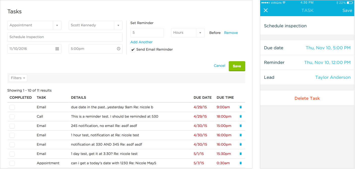
Creating and editing tasks on the desktop web app and native mobile app.


